Seaborn is a very useful data visualization library built on Matplotlib. It provides a high-level interface for drawing attractive and informative statistical graphics. Its beautiful default styles make visualizations easier. It is designed to work very well with Pandas data frame objects and Numpy arrays. You will amazed by how seaborn transfer everything in your mind with only one line of code.
Seaborn’s jointplot displays a relationship between two variables (bivariate) as well as one dimensional profiles (univariate) in the margins. Seing the correlation of two variables and the distributions of these variables gives us a very good understanding of data. This plot is a convenience class that wraps JointGrid. It means (simply) you can use one line of code with jointplot instead of many lines of code in JointGrit.
You can refer to the full documentation of seaborn.jointplot() here.
Let’s begin with importing necessary libraries.
import pandas as pd

import seaborn as sns
import matplotlib.pyplot as plt
Load the seaborn tips dataset.
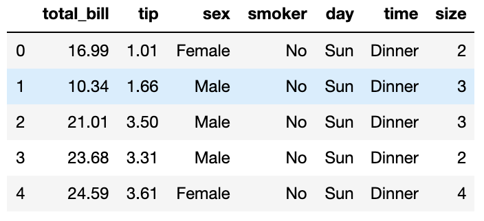
We’ll be using inbuilt dataset provided by seaborn named tips. Tips dataset is about the tips given to the servers by customers in the early 90s for a month and a half month. This dataset is very suitable to show all the wonderful properties of Seaborn. There is a built in method to load the dataset in Seaborn library. Let’s use this method and get the dataset.
df=sns.load_dataset('tips')
df.head()
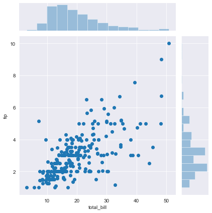
Let’s make a joint scatter plot.
We can easily make an effective scatter plot by writing a few words of code in Seaborn. Default for ‘kind’ is scatter so we do not need to write the kind of the graph if we want to draw a scatter plot. We see the distributions of total bill and tip on the margins and we see the correlation of them on the ‘ joint’ at the center.
sns.jointplot(x='total_bill', y='tip',data=df)
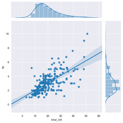
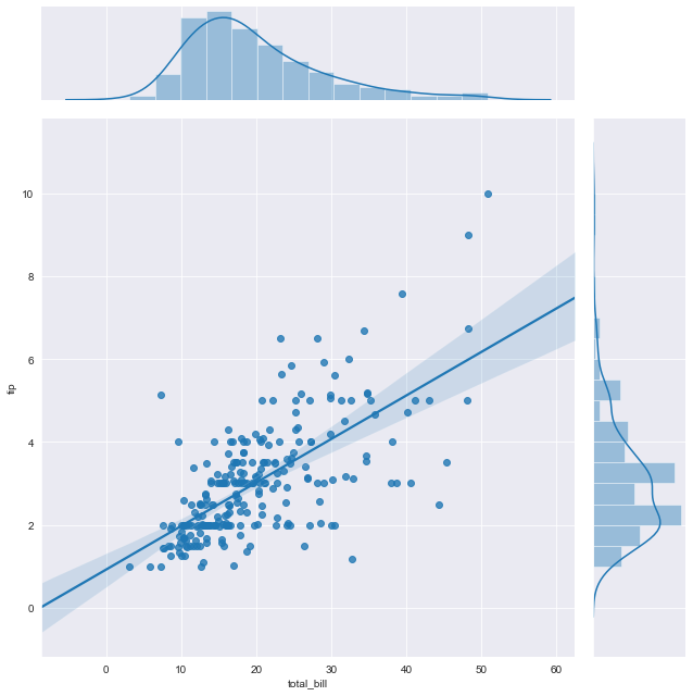
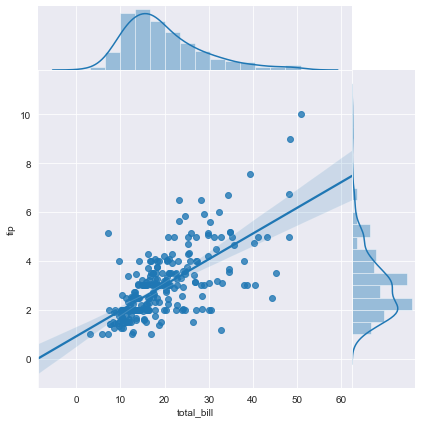
Let’s draw a regression plot.
Linear regression attempts to model the relationship between two variables by fitting a linear equation to observed data. One variable is considered to be an explanatory variable, and the other a dependent variable. If we want to model the correlation of the tips given to the servers and the total bill of the customers we use regression plots to interpret the data much better. The shade around the line shows the confidence level. This level can be changed by changing keyword arguments of regplot() which is used in the jointplot graph to draw the regression lines. Now let’s add kind to the code line to show regression lines and confidence intervals.
sns.jointplot(x='total_bill', y='tip', data=df, kind='reg')
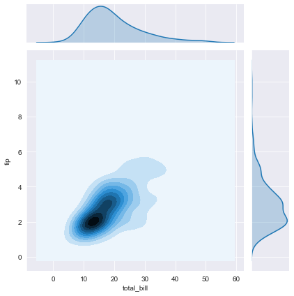
Let’s draw a kernel density estimation plot.
Kernel density estimation(KDE) is a useful technique to create a smooth curve given a set of data. But KDE is not only the shape of data, but also a continous displacement for the discrete histogram. It can also be used to generate points that look like they came from a certain dataset - this behavior can power simple simulations, where simulated objects are modeled off of real data. We can draw the KDE by changing ony three letters.
sns.jointplot(x='total_bill', y='tip', data=df, kind='kde')
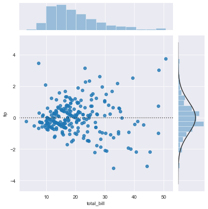
Let’s plot the residuals.
A residual is a measure of how well a line fits an individual data point. For data points above the line, the residual is positive, and for data points below the line, the residual is negative. Checking residuals is important to make the proper regression model.
sns.jointplot(x='total_bill', y='tip', data=df, kind='resid')
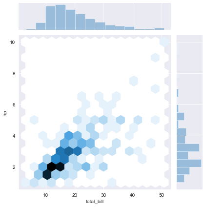
It is time for hexagons.
Hexagonal binned scatter plot(hexbin) is a fairly uncommon style of graphing. Hexbin plots take in lists of X and Y values and return what looks somewhat similar to a scatter plot. In a hexbin the entire graphing space has been divided into hexagons and all points have been grouped into their respective hexagonal regions and color tones are added to indicate the density of each gradient indicating the density of each hexagonal area. White hexagons mean there is no data at that point while dark hexagons mean there is a high density at those points. Hexplots are not very common but they are easier to read than scatter plots.
sns.jointplot(x='total_bill', y='tip', data=df, kind='hex')
Going further with parameters
We will continue with regression plot.
Change the size of both shapes
The default height of the jointplot is 6 but we can change its height by changing the height parameter.
sns.jointplot(x='total_bill', y='tip',data=df,kind='reg',height=9)
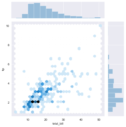
Change the ratio of margins according to the whole shape
The default ratio of the jointplot is 5 but we can change the ratio of the size of the graphs by changing the ratio parameter.
sns.jointplot(x='total_bill', y='tip',data=df,kind='reg',height=9, ratio=10)
Change the space between the graphs
We can set space to zero if we don’t want to have a space between three graphs.
sns.jointplot(x='total_bill', y='tip',data=df,kind='reg',space=0)
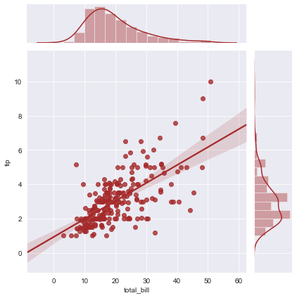
Change the color
We change the color and have better looking graphs.
sns.jointplot(x='total_bill', y='tip',data=df,kind='reg', color='brown')
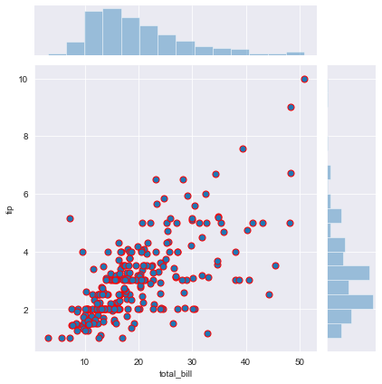
Change the sizes of dots and width of lines circulating the dots.
There are many interesting adjustments to make in the parameters of seaborn jointplot.
g = sns.jointplot("total_bill", "tip", data=df,s=50, edgecolor="r", linewidth=1)
What about keywords?
In every kind of graph there are many keywords for joint and marginals. For example, we can change the grid size by adding a parameter to the joint_kws dictionary.
```sns.jointplot(x=’total_bill’, y=’tip’, data=df, kind=’hex’, joint_kws={‘gridsize’:30})
```
More about joints and margins:
Even if we explore only the visualisation of jointplots in this blog, joint probability distribution has an important place in statistics. It is related to conditional probability and involves a lot of math in it. You can refer to the sources for more information about the theory of jointplots.
Conclusion
Joint plot is a powerful tool to explore distributions and relationships of two variables in details. Seaborn provides a simple default method for making joint plots that can be customized and extended through the Joint Grid class. In a data analysis project, a major portion of the value often comes not in the flashy machine learning, but in the straightforward visualization of data. Jointplots provide us with a comprehensive first look at our data and are a great starting point in data analysis projects.
I welcome feedback and constructive criticism and can be reached at seymatas@gmail.com
Sources:
http://en.wikipedia.org/wiki/Joint_probability_distribution http://machinelearningmastery.com/joint-marginal-and-conditional-probability-for-machine-learning/
https://www.kaggle.com/ranjeetjain3/seaborn-tips-dataset
http://www.stat.yale.edu/Courses/1997-98/101/linreg.htm
https://mathisonian.github.io/kde/
https://medium.com/@mattheweparker/visualizing-data-with-hexbins-in-python-39823f89525e